Bootstrap Demo
Updated on June 26th, 2021 at 1:34 am
What is it?
This Bootstrap Demo is a series of web pages that I created as part of a lesson set in a Udemy course taught by Brad Hussey. I wanted to learn Bootstrap, so I took a course on it and created this site as part of the class project. Though I wrote every line of code, it was pretty much a copy of the instructor’s lessons, with a few of my own changes.
The site consists of three pages, each using a variety of Bootstrap components and layouts.
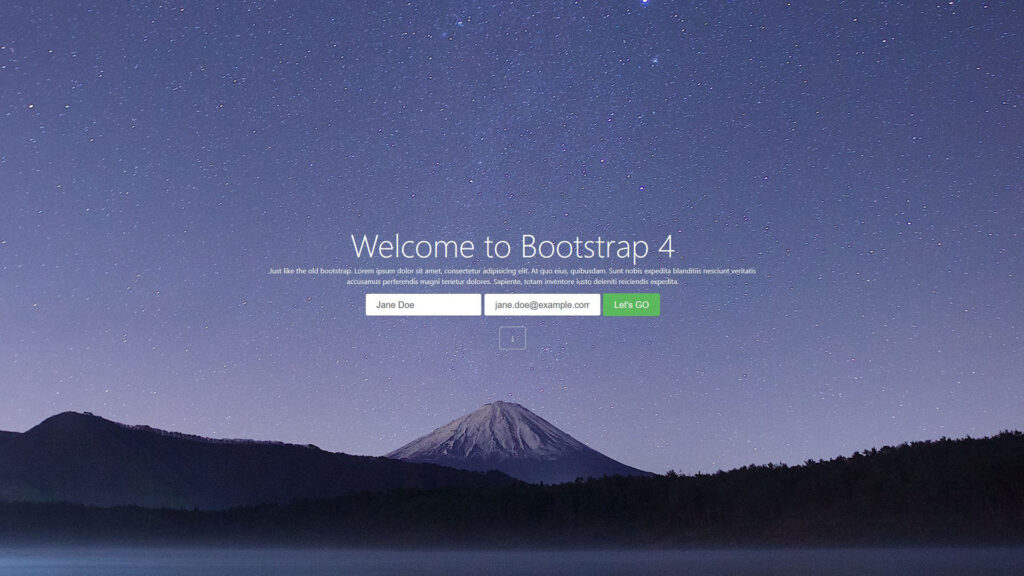
- The Home page consists of a screen-sized title and contact form, a parallax image carousel with captions, a three-column card deck with images, an asymmetrical translucent section above a background image, and a three-column card deck arranged in a masonry-style layout.
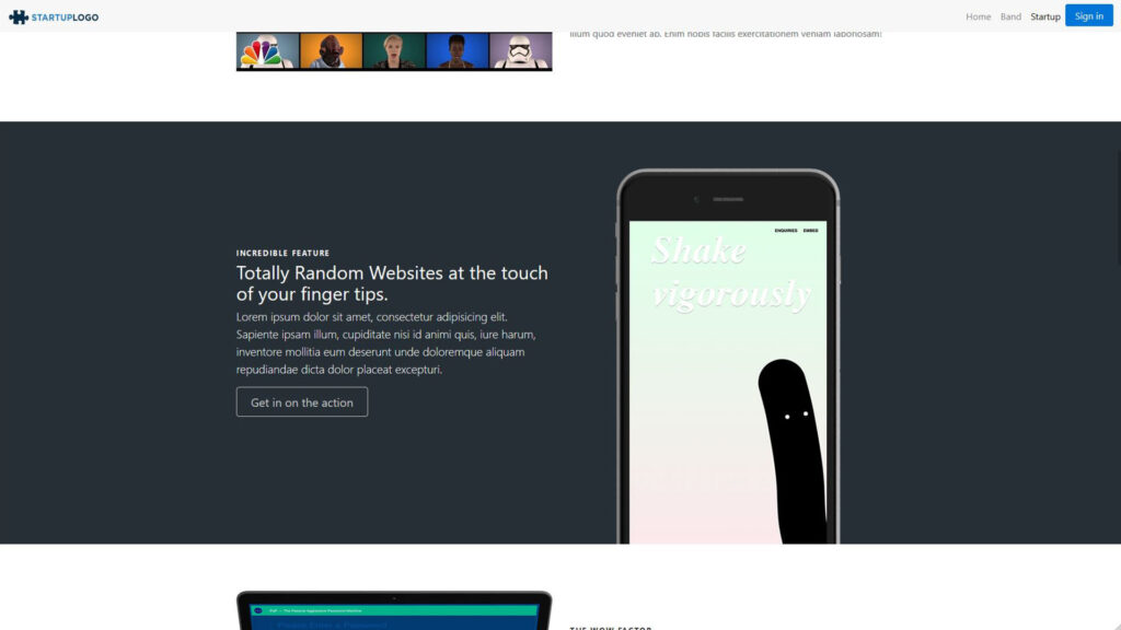
- The Startup Page consists of a screen-sized title and Sign-Up button, various sections with an alternating two-column layout, and modern-styled image placement.
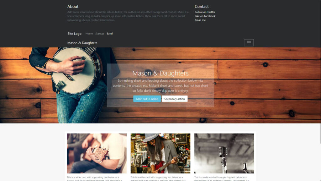
- The Band Page consists of an animated navigation menu that opens down. Within the menu, is a two-column layout and an inner navigation menu. The page also has a translucent section above a background image and a three-column deck of cards.
What does it do?
This site is very much a demo. Most of the links do not go anywhere, the images are free stock photos, and nearly all the content is filler Latin text. I use this demo as a reference when designing layouts for front-end views on other projects. Though this site only represents a small amount of Bootstrap’s potential, it is definitely helpful when I am trying to get ideas on modern layouts, and because I wrote all of the code, it is easy to copy and paste what I need from it.
How does it work?
The code for this project is really light and simple. The work that I created only consists of HTML and CSS. Because the site uses Bootstrap, the style sheets are a lot smaller than you would expect. Bootstrap works in the form of classes, so simply assigning certain elements to specific classes results in a lot a beautiful and powerful functionality without much effort. As an example, the Bootstrap carousel did most of the work to make a responsive and interactive image slider. All I did was model the carousel using the right elements with the correct classes/roles, label the captions, and set up the slider controls using Bootstrap’s API.
Home Page Image Carousel
<!-- HTML -->
<!-- Carousel on Home Page -->
<section id="carousel">
		<div id="carousel-home" class="carousel slide" data-ride="carousel">
			<ol class="carousel-indicators">
				<li data-target="#carousel-home" data-slide-to="0" class="active"></li>
				<li data-target="#carousel-home" data-slide-to="1"></li>
				<li data-target="#carousel-home" data-slide-to="2"></li>
			</ol>
			<div class="carousel-inner" role="listbox">
				<div class="carousel-item active img1">
					<div class="carousel-caption">
						<h3>A woman with a camera</h3>
						<p>She is probably taking a picture</p>
					</div>
				</div>
				<div class="carousel-item img2">
					<div class="carousel-caption">
						<h3>Down came the rain</h3>
						<p>And washed the spider out</p>
					</div>
				</div>
				<div class="carousel-item img3">
					<div class="carousel-caption">
						<h3>Making love</h3>
						<p>With their hands...</p>
					</div>
				</div>
			</div>
			<a class="carousel-control-prev" href="#carousel-home" role="button" data-slide="prev">
				<span class="carousel-control-prev-icon" aria-hidden="true"></span>
				<span class="sr-only">Previous</span>
			</a>
			<a class="carousel-control-next" href="#carousel-home" role="button" data-slide="next">
				<span class="carousel-control-next-icon" aria-hidden="true"></span>
				<span class="sr-only">Next</span>
			</a>
		</div>
	</section>
The CSS is extremely simple. Without it, however, you wouldn’t actually see anything on the page. It controls how large the carousel should be, which images to use, how to display them.
/* CSS */
/* Carousel on Home Page*/
.carousel-inner .carousel-item{
	width: 100%;
	height: 50vh;
	background-size: cover !important;
}
.carousel-inner .img1 {
	background: url('img/woman-camera.jpg') no-repeat center center fixed;
}
.carousel-inner .img2 {
	background: url('img/spiderweb.jpg') no-repeat center center fixed;
}
.carousel-inner .img3 {
	background: url('img/hearthand.jpg') no-repeat center center fixed;
}
Band Page Navigation Menu
The Navigation menu on the Band Page is interesting. Instead of having a menu that turns into a collapsible icon on smaller devices, the reverse happens. Click the hamburger icon, and a navigation menu opens down, revealing a two-column layout as well as an inner navigation menu. This is created using the collapse and bg-inverse classes to make a collapsible menu icon and a navbar-inverse class for the inner navigation menu.
<!-- HTML --> <!-- Band Page Navigation Menu --> <div class="collapse bg-inverse" id="navbarHeader"> <div class="container"> <div class="row"> <div class="col-sm-8 py-4"> <h4 class="text-white">About</h4> <p class="text-muted">Add some information about the album below, the author, or any other background context. Make it a few sentences long so folks can pick up some informative tidbits. Then, link them off to some social networking sites or contact information.</p> </div> <div class="col-sm-4 py-4"> <h4 class="text-white">Contact</h4> <ul class="list-unstyled"> <li><a href="#" class="text-white">Follow on Twitter</a></li> <li><a href="#" class="text-white">Like on Facebook</a></li> <li><a href="#" class="text-white">Email me</a></li> </ul> </div> <nav class="navbar navbar-toggleable-md navbar-inverse bg-inverse"> <button class="navbar-toggler navbar-toggler-right" type="button" data-toggle="collapse" data-target="#navbarNav" aria-controls="navbarNav" aria-expanded="false" aria-label="Toggle navigation"> <span class="navbar-toggler-icon"></span> </button> <a class="navbar-brand" href="#">Site Logo</a> <div class="collapse navbar-collapse" id="navbarNav"> <ul class="navbar-nav"> <li class="nav-item"> <a class="nav-link" href="index.html">Home</a> </li> <li class="nav-item"> <a class="nav-link" href="startup.html">Startup</a> </li> <li class="nav-item active"> <a class="nav-link" href="#">Band</a> </li> </ul> </div> </nav> </div> </div> </div> <div class="navbar navbar-inverse bg-inverse"> <div class="container d-flex justify-content-between"> <a href="#" class="navbar-brand">Mason & Daughters</a> <button class="navbar-toggler" type="button" data-toggle="collapse" data-target="#navbarHeader" aria-controls="navbarHeader" aria-expanded="false" aria-label="Toggle navigation"> <span class="navbar-toggler-icon"></span> </button> </div> </div>
Believe it or not, I didn’t actually create any styles for navigation menu. Bootstrap makes it possible to make minor style changes without using a style-sheet. This is because they took a lot of basic style attributes like margin, padding, padding, text-align, etc. and turned them into classes that can be assigned to their associated elements.